
Maps are supposed to guide us, showing where mountains rise, rivers flow, and oceans stretch. They are tools of exploration, trade, and understanding. But throughout history, many world maps were wildly inaccurate—so much so that they make modern viewers question whether the mapmakers had ever even left their towns. These maps, filled with myths, guesses, and sometimes outright imagination, reveal how humans tried to make sense of a world they barely understood.
The Babylonian World Map: A Flat, Circular Earth
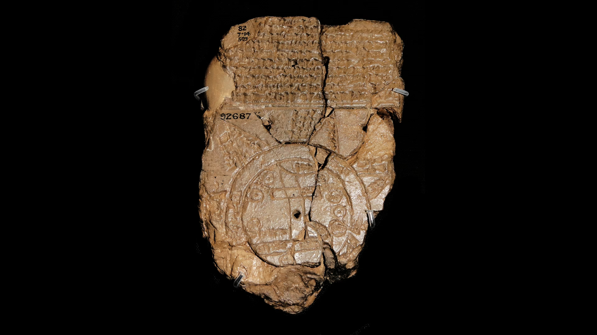
One of the earliest known world maps comes from Babylon, dating back to the 6th century BCE. This clay tablet depicts the world as a flat disk surrounded by a “bitter river” or ocean. The map places Babylon at its center, with distant regions vaguely labeled and mythical creatures lurking at the edges.
For the Babylonians, this map made perfect sense. It reflected their worldview, placing their civilization at the center of existence. But by modern standards, it’s shockingly wrong—Antarctica, the Americas, and Africa are entirely missing, and the proportions of known lands are bizarrely skewed.
Ptolemy’s Map: Ancient Precision with Huge Errors
Claudius Ptolemy, the Greco-Roman scholar of the 2nd century CE, created maps that influenced cartography for over a thousand years. His work included detailed coordinates for many cities and regions. Yet Ptolemy’s maps also contained massive errors:
- He underestimated the Earth’s circumference by about a third.
- He mislabeled Asia and Africa, confusing later explorers.
- He imagined a gigantic Indian Ocean enclosed by land.
Despite these inaccuracies, Ptolemy’s maps were considered authoritative. Explorers like Christopher Columbus relied on them—ironically contributing to the discovery of the Americas while trying to reach Asia.
The Hereford Mappa Mundi: Myth Over Reality
The Hereford Mappa Mundi, created in England around 1300 CE, is one of the most famous medieval maps. Unlike modern maps, it wasn’t meant for navigation. Instead, it combined geography, religion, and mythology into a single illustration.
Jerusalem sits at the center, surrounded by Europe, Asia, and Africa. Exotic creatures, biblical stories, and imaginary islands fill the margins. Rivers flow in strange directions, mountains are exaggerated, and distances are inconsistent. While visually stunning, it is completely useless as a guide—it’s more a worldview than a map.
The Vinland Map: Controversy and Fiction
In the 20th century, the Vinland Map surfaced, claiming to show Viking exploration of North America before Columbus. If genuine, it would have rewritten history. However, the analysis revealed inconsistencies in the ink and geography that led many scholars to suspect it was a forgery.
The map’s depiction of Greenland, North America, and the mythical Vinland highlights mapmakers’ tendency to include lands they had only heard about or imagined. Even maps that claimed to be “accurate” often blended reality with legend.
The Zeno Map: Islands That Don’t Exist
In the 16th century, the Zeno Map depicted the North Atlantic with numerous islands, including Frisland—a massive island that simply doesn’t exist. For decades, sailors searched for Frisland, wasting lives and resources.
This map is a perfect example of how misinformation spread in pre-modern times. Stories from sailors, misread accounts, and wishful thinking were recorded as fact, misleading generations of explorers.
Oronce Fine’s Heart-Shaped World
In 1531, French cartographer Oronce Fine created a heart-shaped world map that was both imaginative and geometrically complex. While visually striking, it contained countless errors:
- The Americas were distorted.
- Africa’s shape was completely off.
- The Pacific Ocean was misrepresented, with islands appearing where none exist.
Fine’s map shows how mathematical skill and artistic vision could coexist with incredible geographic inaccuracy. It reminds us that cartography was as much an art as a science.
Mercator Projection: Useful but Misleading
The Mercator Projection, created by Gerardus Mercator in 1569, revolutionized navigation by representing straight lines as constant compass bearings. Yet it massively distorted size:
- Greenland appears as large as Africa, when in reality it’s 14 times smaller.
- Northern Europe looks gigantic compared to equatorial Africa.
While useful for sailors, it shaped public perception of the world for centuries, giving skewed ideas of power, size, and importance. This map demonstrates that even “accurate” maps can mislead depending on perspective.
Lessons from Wrong Maps
These historical maps show that maps are not just about geography—they reflect culture, knowledge, and imagination. Before satellites and GPS, mapmakers relied on hearsay, explorers’ tales, and sometimes pure speculation.
Many “wrong” maps influenced explorers, shaped empires, and even sparked myths. They remind us that human understanding evolves over time, and what seems absurd today was once the cutting edge of knowledge.
The Fascination with Mistakes
The strangest thing about these maps isn’t just their errors—it’s the creativity and boldness behind them. Mapmakers tried to capture the unknown, filling gaps with dragons, islands, or religious symbolism. Each mistake tells a story of curiosity, ambition, and sometimes fear.
In a way, these maps are more than errors—they are windows into the human mind, showing how people made sense of a world far bigger and stranger than they could imagine.
From Babylon to Mercator, the history of cartography reminds us: maps can lie, exaggerate, and fantasize—but they always reflect our desire to understand the world.